Product Design | Class Project
Interactive Edutainment
Students utilize activity-centered design to develop a suite of interrelated, interactive products intended to be both educational and entertaining for kids.
The Design Challenge
THE PROMPT
TOPIC SELECTION
TOPIC SELECTION
Students are given a prompt to respond to, but with enough flexibility to do some problem-finding. They are presented with research reports that claim that activity levels for kids drop after age eight and screen time and mobile usage increases. The challenge is to design an activity for children between the ages of 8 and 13 that is both educational and entertaining (i.e. edutainment). We discuss the concept of stealth learning, where kids feel like they are just playing a game, but they are actually learning.
TOPIC SELECTION
TOPIC SELECTION
TOPIC SELECTION
After selecting an activity, students start researching the topic. Designing for kids gets many students out of their comfort zone, which requires them to do secondary research about the age group (e.g. developmental milestones). When selecting a topic, students are encouraged to think back to when they were a kid: What did they like or dislike? This gives students a “point of view” on the project. They are encouraged to play games, use their imagination, be super creative, and ask ‘what if’ questions as their concept evolves.
Discovery Research
THE PITCH
PERSONAS & SCENARIOS
PERSONAS & SCENARIOS

They pitch an idea for interrelated products for the physical and digital environments. The starburst method (a.k.a. six questions) is utilized for the pitch format. This method encourages them to think about the purpose of the activity, look at existing products, identify primary and secondary users, and consider the context of use.
PERSONAS & SCENARIOS
PERSONAS & SCENARIOS
PERSONAS & SCENARIOS

Personas are incorporated into the process to humanize the project. The educator provides a few examples, but students can create them as well, so long as they are based on real people. Students write a use-case scenario that explains how their persona(s) use products to perform tasks in a specific context.
Concept Development
UNDERSTANDING THE ACTIVITY

After the pitch, students are asked to analyze the activity in order to thoroughly understand the behaviors involved in doing it. They divide the activity into tasks and sub-tasks. Then, they visualize it by creating either a task analysis, flow chart, service blueprint, or user pathway.
MOOD BOARDS

Mood boards are utilized to explore a variety of creative directions. Students make three mood boards. Each board includes color swatches, typography, sample imagery, and UI elements. In the example above, you can see the direct relationship between the boards and a sample screen.
BRANDING
PRODUCT SKETCHES
PRODUCT SKETCHES

Branding involves naming the activity and designing both an app icon and traditional logo. These branding assets can be used across a variety of products. The brands often feature a main character(s), like the example shown here. In the Adventures of Sketch, kids use drawing skills to solve problems caused by evil Dr. Eraser.
PRODUCT SKETCHES
PRODUCT SKETCHES
PRODUCT SKETCHES

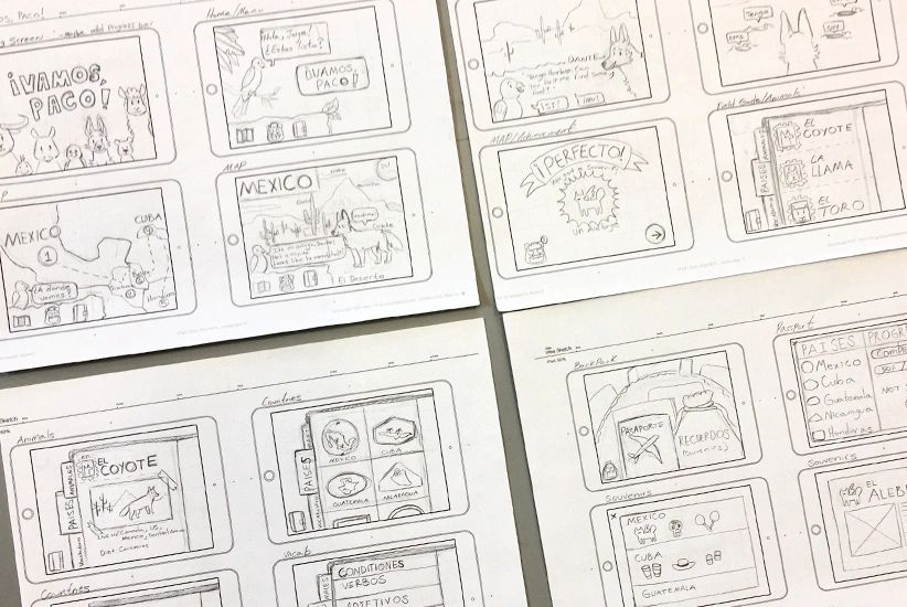
Students create a paper prototype of the iPad app. For the more immersive concepts, the paper prototypes resemble storyboards. These apps utilize narrative to engage users in a story, thus the navigation models are hard to define. Students also generate sketches to determine the specifications of the other product(s).
Prototypes
DIGITAL & PHYSICAL PRODUCTS

Students design screens for the app and graphics for the additional product. The top example is from Super Signer, which helps kids learn American Sign Language through interactive games. The bottom example is from Nounja, a ninja-themed concept for active kids to learn about language arts.
HIGH-FIDELITY PROTOTYPE

After completing an in-class exercise in InVision Studio, students build a high-fidelity, interactive prototype. This example is a language-learning app called Vamos, Paco! which teaches children about the animals, culture and geography of various Spanish-speaking countries.
Final Solution
RESULTS
This project concludes with presentations, in which students are asked to explain their concept, discuss branding, articulate how the products are related, and demonstrate how the activity works by doing a walkthrough.
Edutainment products from this class project have received numerous Gold and Silver ADDY Awards, including a Judge’s Choice Award from AAF Jacksonville.
Copyright © 2025 Natalie W. Stephenson - All Rights Reserved.